
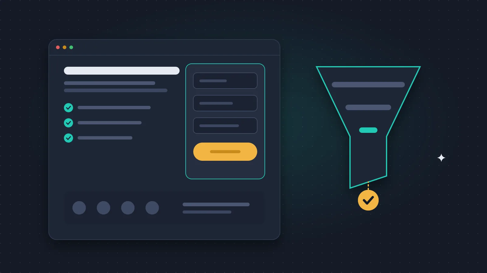
A landing page is a page built for one audience and one specific offer, leading to one clear next step: a quote request, a booking, a sign-up or a purchase.
When I talk to clients about landing pages, the first question is almost always how many visitors it will bring. I usually turn it around: who do you want to hear from, and what do they need to see before they write to you? A landing page is not judged by its visitor count. It is judged by whether enquiries arrive that can turn into business.
When is a landing page better than the homepage?
If an ad promises one service, the person clicking wants the details of that service. On a homepage that presents everything you do, they have to find it again, and many will not bother. On a focused landing page they see the continuation of the offer straight away.
Good use cases: launching a new service, addressing one industry, an event registration, a clearly defined campaign.
If the visitor wants to get to know the company, compare several solutions and look for references, a full company website is the better route. The two work well side by side.
What should the main message be?
The opening should say briefly who you help, in what situation, and what the next step is. Name a specific task instead of general adjectives.
An imaginary B2B maintenance company could write "Industrial machine maintenance for manufacturing plants" instead of "Your reliable partner for the future", and say in the next sentence exactly which jobs it takes on. It looks like a small difference, but visitors decide in the first seconds whether they are in the right place.
The ad, the page title and the button text should all build on the same promise. If the ad offers an assessment, the button should not lead to ordering something else entirely.
What sections should it have?
I usually start from this order and adapt it to the offer:
- Offer and main button. What does the visitor get, and how do they start?
- Who it is for. Which situation is the service right for?
- Exact scope. What is included, and what is not?
- The process. What happens after they get in touch?
- Proof. A real reference, a verifiable result, or a clear explanation of the method.
- Decision questions. Budget range, conditions, preparation.
- The enquiry. A short, working form with clear feedback.
Only show results and testimonials you can back up. If a service is new, explaining how you work helps a lot, but do not present something as a client reference when it is not.
What should the form ask?
As much as you need for a sensible next step. Besides name and contact details, a short question about the task is often enough. If the service is only available in certain places, ask for the location as well.
Fewer people complete a long form. A form that is too short brings many enquiries that then need long back-and-forth. On our own homepage there is a quick audit request where you only enter your website address and an email, because there the first step is starting a conversation, not collecting a full brief.
The button should name the action, for example "Request an assessment" or "Send my enquiry". After submitting, it should be clear that the message arrived and what happens next. Only promise a response time you can actually keep.
Check mobile separately
On a narrow screen, a long intro, a big image or a pop-up easily hides the enquiry. Visitors need readable text, buttons that are easy to tap and fields that are comfortable to fill in.
Test the whole flow: opening the page, understanding the offer, filling in the form, error messages, successful submission. We learned this the hard way. For a while the form on somosmedia.co silently dropped messages whenever the browser's autofill also filled a hidden anti-spam field. From the outside everything looked fine. The enquiries just did not arrive. Since then we test every form in a real browser with autofill on.
For speed, look at what matters to the visitor: when do they see the offer and the button. I wrote more about it in the guide to website speed optimisation.
How to measure real enquiries
Track the button click, starting the form and successful submission as separate events. If you only measure clicks, broken or abandoned flows also look like results.
In sales, note which enquiry was relevant, which led to a call, a proposal and finally a client. That is where the combined performance of the ad and the landing page really shows.
A simple calculation: 20 enquiries from 1,000 visits is a 2% submission rate. If 8 of them fit the service, the rate of qualified enquiries is 0.8%. This is only an illustration, not a market average, but it shows that the two numbers say different things. That is why conversion optimisation has to look at traffic quality and the offer itself, not only the form.
Does a landing page need SEO?
If the page answers a long-term search need, plan it as a standalone, useful page with a clear topic and an accurate title.
For a short campaign page, decide separately whether it should be indexed. But do not build many almost identical pages just because the city name or one keyword changes. We considered that for our own site and decided against it, because it would give the visitor nothing new.
Ads bring visitors faster. Traffic from search needs its own SEO work. I described the role of each in the comparison of SEO and paid search.
What to fix first if enquiries are scarce
First check that the form and the tracking actually work. That is not a formality: our own bug above was found exactly this way. Then check whether the right people arrive, and whether they recognise the offer meant for them.
With low traffic, a few conversations with real prospects tell you more than an A/B test evaluated too early. If you do test, decide the main outcome in advance, and do not declare a winner based on one good day.
Frequently asked questions
Can a landing page have a menu?
Yes, if it helps the decision. But the main path should stay obvious, and the visitor should not lose sight of the offer they saw in the ad.
Does a short or a long page work better?
It depends on how complex the offer is and how much the visitor already knows. You need as much information as the next step requires. Length on its own is not the measure.
How much does a landing page cost?
Copywriting, design, features, integrations and tracking decide it. When comparing quotes, make sure they all include the same tasks.
Is a contact button enough?
For a simple offer it can be, but measure whether contact actually happened. A button click is not yet a lead.
When should I make a separate page for another audience?
When the offer, the problem or the proof needed for the decision is genuinely different. Swapping one keyword is not a reason for a new page.
Planning a landing page for a specific service? Tell me who the offer is for and what kind of enquiries you want. That is where we start with the content, the build and the measurement.